01
Fasto
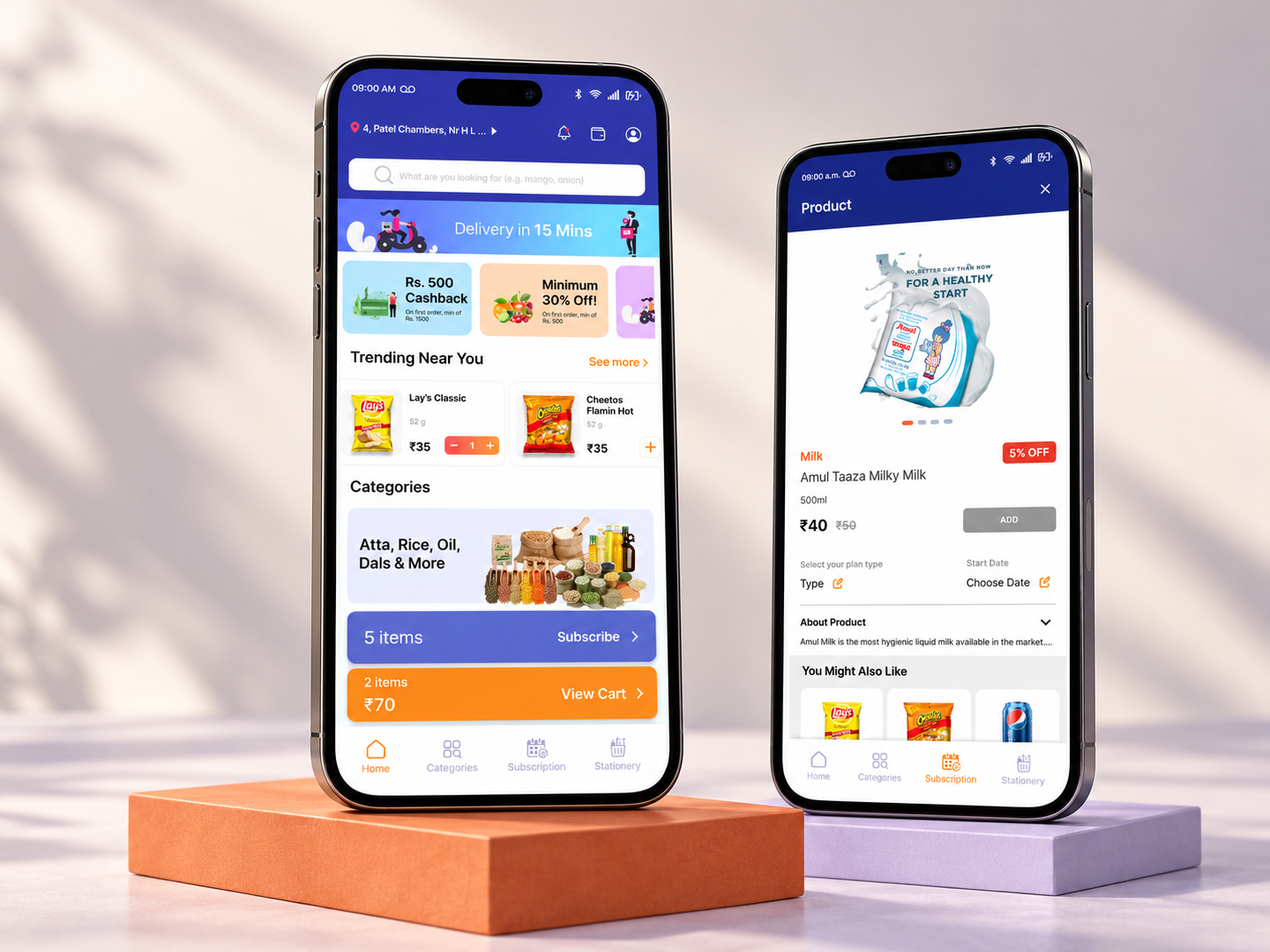
Grocery delivery appVIEW CASE STUDY ↗A grocery delivery app designed around product discovery, repeat shopping, and a clear path to checkout.
A grocery delivery app designed around product discovery, repeat shopping, and a clear path to checkout.
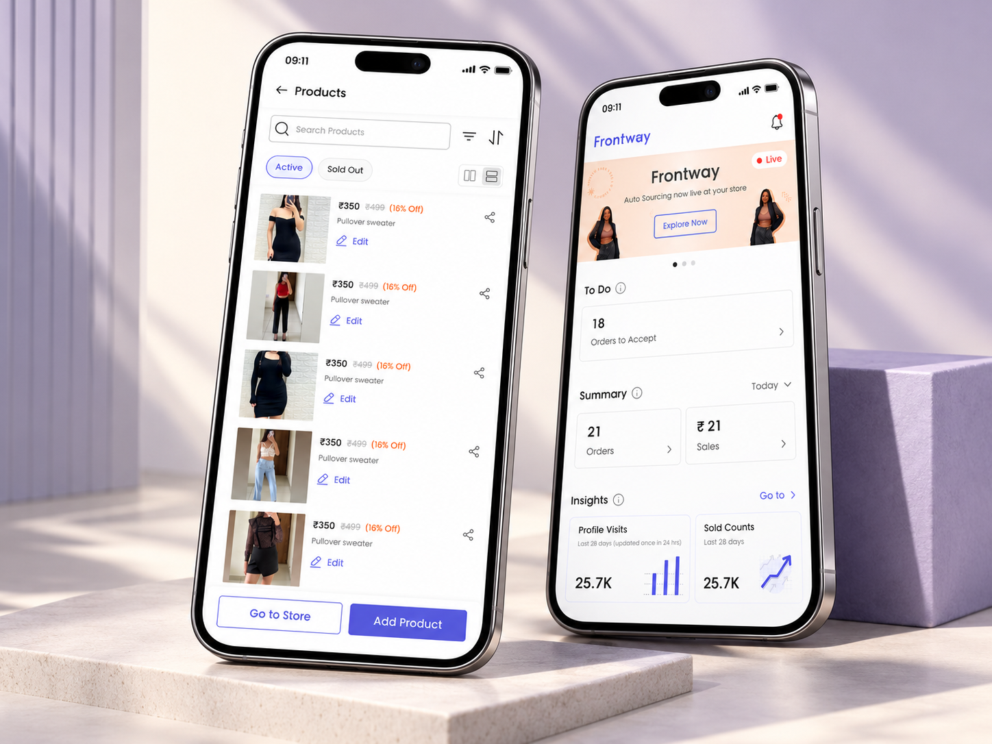
A fashion shopping app with a consistent UI foundation and supporting seller/store-management flows.
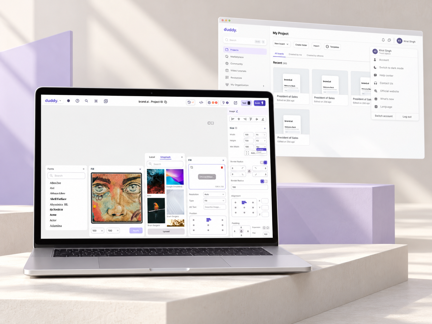
A no-code app builder that connects project setup, visual editing, preview, and sharing.
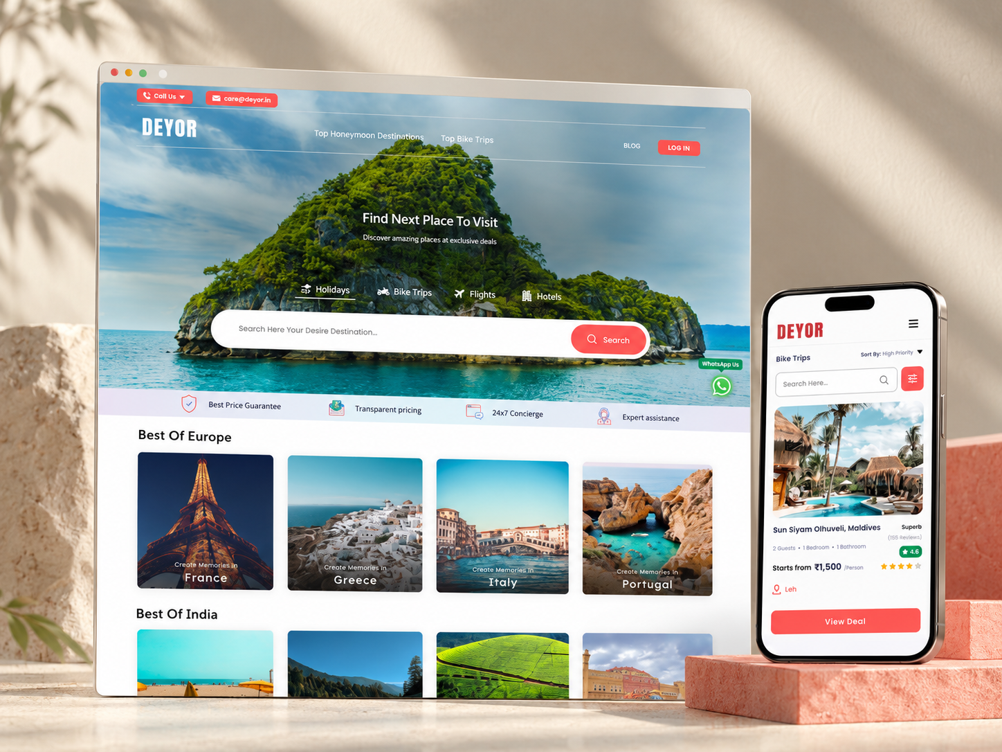
A travel website connecting destination discovery, itinerary planning, collaboration, and booking.
Looking for a UI/UX designer? Let’s build intuitive SaaS products, dashboards, websites, and mobile experiences together.
LET’S TALK ↗ MOHAMMAD BAKIR / PRODUCT DESIGNER
I’m Mohammad Bakir, a UI/UX and product designer with 3+ years of experience. I turn research and business needs into intuitive SaaS products, dashboards, websites, and mobile experiences. At Dotix, I lead a team from client brief to delivery, balancing usability with technical feasibility.
Lead 2 developers and 1 designer from client brief through delivery. Design SaaS platforms, web applications, and websites, translating business goals into high-fidelity interfaces.
Designed dashboards and related interfaces, applications, and websites. Worked with clients to translate briefs into functional designs across concurrent projects.
Built and customized client WordPress websites, including theme configuration and design adjustments, while completing formal education.
User research · Experience mapping · Wireframing · Prototyping · Design systems · Responsive design · Usability testing · Motion design
Figma · Adobe XD · Photoshop · Illustrator · Framer · HTML/CSS · Jira · Notion
Team leadership · Developer handoff · Design critique · Client communication
MBA, Marketing · 2020–2022
B.Com · 2017–2020
MJP Rohilkhand University
Google UX Design Specialization
Coursera · 2023
A grocery delivery app designed around product discovery, repeat shopping, and a clear path to checkout.
Fasto brings everyday grocery shopping into a mobile delivery experience. The design organizes a broad catalog into familiar categories and connects discovery, product selection, subscriptions, and payment.
The project brief focuses on reducing the effort of everyday shopping. A wide product range, repeat purchases, and payment choices need a clear hierarchy so shoppers can find what they need without losing track of their order.
A grocery delivery app designed around product discovery, repeat shopping, and a clear path to checkout.
The supplied case study documents research, competitor analysis, personas, empathy mapping, journey mapping, user flows, information architecture, high-fidelity design, prototyping, and feedback. Those stages connect the shopping needs to the final app screens.
Explore the original research, flows, wireframes, and visual design in the supplied Figma case study.
OPEN FIGMA CASE STUDY ↗Categories such as fruit, vegetables, dairy, and household essentials provide recognizable starting points. Product sections and search support both browsing and finding a specific item.
Product cards group the item name, quantity, price, discount, and add action in a repeated pattern. That consistency helps shoppers compare items across the catalog.
Subscriptions and wallet/payment flows extend the experience beyond a single order. The design treats repeat shopping and checkout as connected parts of the journey.
Original screens from the project. Select a screen to explore the full design.
The resulting design brings product discovery, category browsing, repeat shopping, and payment into a shared mobile interface. The case study board documents the visual direction and process; measured business outcomes are not stated here.
A fashion shopping app with a consistent UI foundation and supporting seller/store-management flows.
The detailed project board below focuses on the seller and store-building side of the commerce experience.
SCROLL TO EXPLORE ↓Frontway is a fashion shopping app with supporting seller tools for creating a storefront, listing products, and managing an online store.
The seller-side brief describes the difficulty of building an online presence without technical expertise. The design needs to organize store setup, product listing, and customization into a clear sequence while maintaining a consistent interface.
A fashion shopping app with a consistent UI foundation and supporting seller/store-management flows.
The work included competitive analysis, design system development, prototyping, and a UX review. The project board presents discovery, personas, wireframes, interface design, feedback, and developer handoff.
Explore the original research, flows, wireframes, and visual design in the supplied Figma case study.
OPEN FIGMA CASE STUDY ↗A shared design system supports repeated controls, product layouts, and interaction patterns across the mobile experience.
The seller flow connects store creation, product listing, and storefront customization. This supporting experience is shown separately from the customer-facing fashion-shopping description.
Prototypes and the UX review helped develop the application experience. The Figma board provides the detailed process, wireframes, and interface examples.
Original screens from the project. Select a screen to explore the full design.
The documented deliverables include competitive analysis, a design system, prototypes, and a UX review. The seller/store-builder board adds context for the commerce tools. No unverified conversion or sales metrics are included.
A no-code app builder that connects project setup, visual editing, preview, and sharing.
Duddy helps people assemble responsive apps from visual elements. The design focuses on making a capable builder approachable through clear hierarchy, contextual controls, and understandable feedback.
Dense panels, unfamiliar builder language, and hidden relationships can make first-time creation feel technical. The project frames the challenge as providing one clear path from setup to building, testing, and sharing while retaining depth for experienced makers.
A no-code app builder that connects project setup, visual editing, preview, and sharing.
The supplied case study documents discovery, task models, information architecture, interaction design, visual systems, prototyping, usability testing, and developer handoff. The narrative follows where users lose momentum during setup, canvas editing, preview, and sharing.
Explore the original research, flows, wireframes, and visual design in the supplied Figma case study.
OPEN FIGMA CASE STUDY ↗Project setup and the dashboard establish the product model before users enter the builder. The aim is to make the next meaningful action visible.
The canvas, layer hierarchy, and inspector work together so people can understand what they have selected and how it relates to the app structure.
Preview, responsive behavior, and issue states help users assess their work while they build, rather than treating validation as a separate final step.
Original screens from the project. Select a screen to explore the full design.
The design presents a more coherent journey from project creation to visual building and validation. The supplied Figma board includes the detailed research narrative and interface work. This portfolio summary does not introduce additional research counts or performance claims.
A travel website connecting destination discovery, itinerary planning, collaboration, and booking.
Deyor brings travel discovery, planning, and booking into a connected website experience. A shared trip model links destinations, dates, stays, activities, collaborators, and checkout.
Travel ideas often become scattered across screenshots, booking sites, maps, and group chats. The project explores a continuous path from inspiration to an organized, shareable itinerary and a confident booking decision.
A travel website connecting destination discovery, itinerary planning, collaboration, and booking.
The supplied case study follows discovery, research synthesis, journey mapping, wireframes, interface design, and usability iteration. It connects planning concerns such as choice overload, coordination, and unclear totals to the structure of the website.
Explore the original research, flows, wireframes, and visual design in the supplied Figma case study.
OPEN FIGMA CASE STUDY ↗The itinerary acts as a shared structure for places, dates, stays, and activities, reducing disconnected steps between discovery and planning.
Destination and route ideas explain their fit and pace, helping travelers compare meaningful options rather than scanning an undifferentiated list.
A visible itinerary, collaboration tools, availability, and clear totals support decisions before travelers commit to booking.
Original screens from the project. Select a screen to explore the full design.
The resulting website direction connects discovery, itinerary planning, collaboration, and booking. The project board includes responsive and mobile explorations alongside the website. No additional business-result claims have been added.